

We’ve already given you a lot of insights into the functionality of our Excel Add-In (Management 4 SharePoint – the Excel Add-In to manage your SharePoint projects) for SharePoint management (for example Excel Add-In functionality for managing SharePoint). In order tooptimize usability, we have given our Add-In a completely new and modern design. We have used different possibilities to make the Add-In and its functions even clearer and more intuitive.
Conditional formatting for different areas
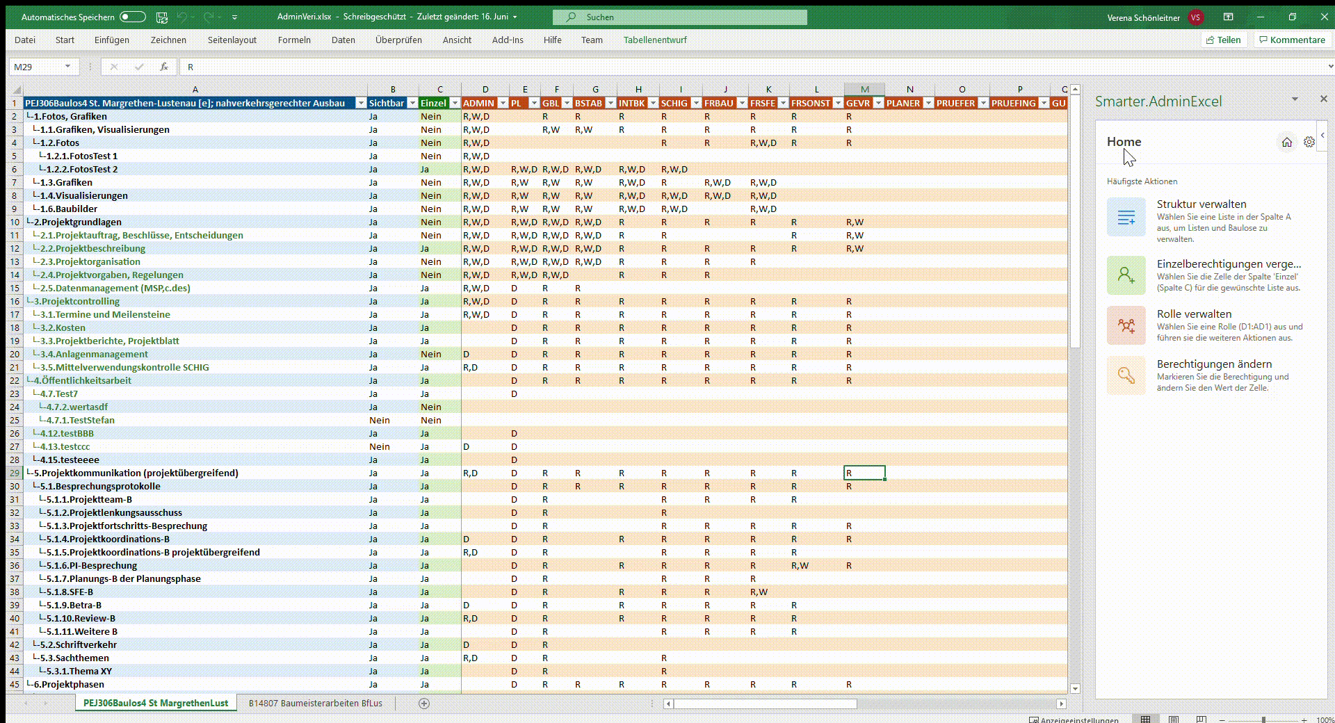
We have divided our Excel into three main areas. The first (blue) area displays all SharePoint lists of the current web. The second (green) area indicates whether the respective lists have set individual permissions. The third (orange) area renders all associated role permissions. When selecting colors, we have made sure that a harmonious overall picture is created and that the separation of the different areas remains recognizable. We have implemented the different coloring of the individual areas by conditional cell formatting.
list column
const conditionalFormatList = table.columns.getItemAt(0).getDataBodyRange().conditionalFormats.add(
 Excel.ConditionalFormatType.custom
);

conditionalFormatList.custom.rule.formulaLocal = '=MOD(ROW();2)<>1';
conditionalFormatList.custom.format.fill.color = ExcelColors.lightBlue;
In our case, we’ve added a rule for rows with even row number to create an alternating row coloring. We highlight the corresponding area of a function when “hovering” the action button. As a result, the user can see more clearly which functions apply to which area.
Freeze rows and columns
We built our Excel like a matrix. In this, the rows represent the SharePoint lists and the columns represent the SharePoint roles. In the “middle” of the matrix, we render the associated permissions. That the names of the lists and roles are always visible, we have fixed the first row and the first 3 columns of our Excel. We implemented this with the following snippet of code:
Freeze first row
worksheet.freezePanes.freezeRows(1);

Freeze first three columns
worksheet.freezePanes.freezeColumns(3);
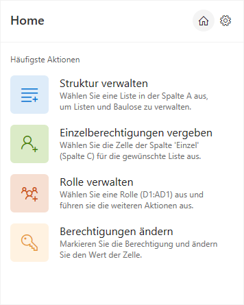
New Home Screen
To make the use of our Excel Add-In even more intuitive, we have implemented a home screen. We designed it to match the new design of our Excel Add-In. On this we list the most used functions. As a result, we make it easier for the user to use the Add-In for the first time. In addition, the user receives short description texts for the functions, which serve as a help. By clicking on the home icon in the header the user can return to this home screen at any time
Action Buttons for Functionalities
We have now implemented a uniform design for all functionalities in our Add-In. Functionalities are now displayed by “Action Buttons”, which consist of an icon, a title and a short description. This allows us to provide the user additional information about the functionality. For example, in the “Create new list” function, we added the description “Create a new list under selected list”. This provides the user the additional information that the new list is created under the currently selected list.
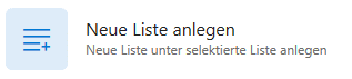
We use the action buttons on all screens of our Excel Add-In to provide a consistent and clear design.

Have we aroused your interest with our product “Management 4 SharePoint – the Excel Add-In to manage your SharePoint projects” and would you like to know more about this? Then contact us today by clicking on the button!